Appearance
Chapter 5 - Intro to Unit Testing While Refactoring a Bit
We will now delve into writing unit tests for our project. Unit tests serve as a critical aspect of ensuring the stability and reliability of our code. In this book, we will cover two main categories of unit tests:
- Unit tests for models, classes, structures, and interfaces (such as the API client and helpers)
- Unit tests for Svelte components
Note: It's worth mentioning that there is a third category of tests, known as end-to-end (e2e) tests, but we will not be covering those in this book.
Our first step will be to write unit tests for our Svelte components. We will start with the ItemsList component and while doing so, we will make some refactors to improve its implementation. The unit tests will validate the changes we make, ensuring that our code remains functional and free of bugs.
ItemComponent
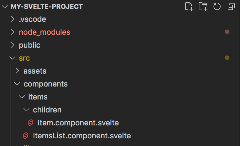
Remember how in our ItemsList component we have a loop that creates <li> elements, one for each item in our items property? Let's extract the code for the <li> element and create a child component just for that. Let's start by adding a new file called Item.component.svelte under the src/components/items/children directory:
Paste the following code in the file:
html
// file: src/components/items/children/Item.component.svelte

<script lang="ts">
  // import createEventDispatcher from Svelte:
  import { createEventDispatcher } from 'svelte'
  // import a reference to our ItemInterace
  import type { ItemInterface } from '../../../models/items/Item.interface'

  // expose a property called testid. This will be useful for the unit tests (or automation testing)
  export let testid: string = 'not-set'

  // expose a property called items with a default value of a blank array
  export let item: ItemInterface = {
    id: -1,
    name: '',
    selected: false
  }

  // create an instance of Svelte event dispatcher
  const dispatch = createEventDispatcher()

  // a computed property to return a different css class based on the selected value
  $: cssClass = (): string => {
    let css = 'item'
    if (item.selected) {
      css += ' selected'
    }
    return css.trim()
  }

  // item click handler
  function handleClick (item: ItemInterface) {
    // dispatch a 'selectItem' even through Svelte dispatch
    dispatch('selectItem', {
      item
    })
  }
</script>

<li data-testid={testid} role="button" class={cssClass()} on:click={() => handleClick(item)}>
  <div class="selected-indicator">*</div>
  <div class="name">{item.name} [{item.selected}]</div>
</li>

<style>
  li.item {
    padding: 5px;
    outline: solid 1px #eee;
    display: flex;
    align-items: center;
    height: 30px;
    cursor: pointer;
    transition: background-color 0.3s ease;
  }
  li.item .name {
    margin-left: 6px;
  }
  li.item .selected-indicator {
    font-size: 2em;
    line-height: 0.5em;
    margin: 10px 8px 0 8px;
    color: lightgray;
  }
  li.item.selected .selected-indicator {
    color: skyblue;
  }
  li.item:hover {
    background-color: #eee;
  }
</style>
We just created a template for a single <li> element. We also enhanced this a bit by replacing the rendering of the name with binding { item.name } with two child <div> elements:
- one to display the Item name
- one that will show a star icon (we are just using a char here, but in the next chapters we'll be replacing this with real icons)
Then we added a computed property called cssClass that will return the string "item" or "item selected". We then bind this to the <li> class attribute, based on whether the model.selected property is true or false: <li class={cssClass()} on:click={() => handleClick(item)}>
This will have the effect to render the <li> element in two possible ways:
- <li class="item"> (when not selected)
- <li class="item selected"> (when selected)
We also bind to the click event with on:click binding and in the local handleClick handler we just invoke the parent handler by dispatching the event "selectItem" with dispatch (Svelte event dispatcher[1]) and passing the item as the event argument. We will then handle this in the parent component (ItemsList component).
Note that we also added a <style> section with some css to render our <li> element a little better. The css above is just a quick-and-dirty bit of styling so we can make our list look a bit prettier for now. In later chapters we'll introduce TailwindCSS and keep working with that instead of writing our own css.
Let's also add some css at the end of the ItemsList.component.svelte component:
html
// file: src/components/items/ItemsList.component.svelte

...

<style>
  ul {
    padding-inline-start: 0;
    margin-block-start: 0;
    margin-block-end: 0;
    margin-inline-start: 0px;
    margin-inline-end: 0px;
    padding-inline-start: 0px;
  }
</style>
And add some css at the end of the App.svelte code:
html
// file: src/App.svelte

...

<style>
  .home {
    padding: 20px;
  }
</style>
Note: we are not consuming our new Item.component.svelte anywhere yet. Let's proceed first to create a unit test against it and validate that it renders and behaves as we expect.
Add unit tests support to our project
We need to configure our project to be able to run unit tests. We need to add dependencies on a few npm packages and some configuration in order to be able to add unit tests for our components.
NOTE: In a preliminary version of this book we were using jest, but jest has become quite old and going forward is much better to use Vitest. Therefore, changes have been made in the latest version of this book. If you run into trouble please refer to the public GitHub repository for the sample source code.
Dependencies
Let's start installing our npm dependencies first.
Install Vitest[2] npm package:
bash
npm i -D vitestInstall Svelte Testing Library[3]:
bash
npm i -D @testing-library/svelteInstall jsdom and @types/jest:
bash
npm i -D jsdom @types/jestConfiguration
Now we need to configure a few things to be able to run unit tests.
tsconfig.json file
Add "vite/client" and "vitest/globals" to tsconfig.json compilerOptions types:
json
// file: my-svelte-project/tsconfig.json

...

  "compilerOptions": {
    ...,
    "baseUrl": ".",
    "paths": {
      "@/*": [
        "src/*"
      ]
    },
    "types": [
      "svelte",
      "vite/client",
      "vitest/globals"
    ]
    ...
vite.config.js files
Add "test" section with the following settings to the vite.config.js files:
json
// file: my-svelte-project/vite.config.js (and any other vite.config.xyz.js file)

...

  export default defineConfig({
    ...
    test: {
      globals: true,
      environment: 'jsdom',
      exclude: [
        'node_modules'
      ]
    }
  })
package.json
Within the package.json file, add the following command shortcuts within the script section:
json
...

  "scripts": {
    ...
    "test": "vitest run",
    "test-watch": "npm run test -- --watch",
  }
...
ItemComponent Unit Tests
Add our first two unit tests again our newly created component ItemComponent.
Within the same directory where our Item.component.svelte is located, add two new files:
- one called Item.rendering.test.ts
- one called Item.behavior.test.ts
Your directory structure will look now ike this:
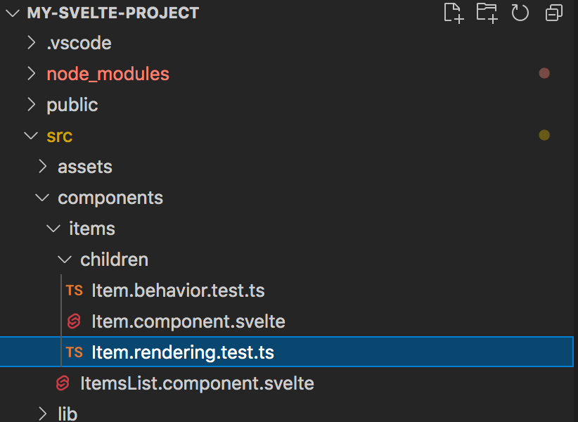
Item.rendering.test.ts
Open the file Item.rendering.test.ts and paste the following code in it:
typescript
//file: src/components/items/children/Item.rendering.test.ts

// import a reference to testing library "render"
import { render, screen } from '@testing-library/svelte'

// import reference to our interface
import type { ItemInterface } from '../../../models/items/Item.interface'
// import reference to your Item component:
import component from './Item.component.svelte'

describe('Item.component: rendering', () => {

  it('renders an Item text correctly', () => {
    // our data to pass to our component:
    const item: ItemInterface = {
      id: 1,
      name: 'Unit test item 1',
      selected: false
    }

    const testid = 'unit-test-appearance-2'

    // render component
    render(component, {
      testid,
      item
    })

    // get element reference by testid
    const liElement = screen.getByTestId(testid)

    // test
    expect(liElement).not.toBeNull()
    // check that the innterHTML text is as expected
    expect(liElement.innerHTML).toContain('Unit test item 1')
  })

})
...
Here we test that the component renders the data model properties as expected.
Note: These example are just to get you started. Later you can look at more precise ways to test what our component has rendered or even trigger events on them.
Run our unit tests from the terminal with this command:
bash
npm run testIt should run the unit tests and print the results on the terminal, similar to this:
bash
...

> my-svelte-project@1.0.0 test
> vitest run

 RUN  v0.23.4 ...

 √ src/components/items/children/Item.rendering.test.ts (1)

Test Files  1 passed (1)
     Tests  1 passed (1)
  Start at  18:24:17
  Duration  1.09s (transform 531ms, setup 0ms, collect 355ms, tests 10ms)

...
Let's add two more tests within the same file to check that the component has the expected CSS classes. Test to check that it has the class "selected" when item.selected is true, and that does NOT have the css class "selected" when item.selected is false:
typescript
// file: src/components/items/children/Item.rendering.test.ts

...

describe('Item.component: rendering', () => {

  ...

  it('has expected css class when selected is true', () => {
    // our data to pass to our component:
    const item: ItemInterface = {
      id: 1,
      name: 'Unit test item 2',
      selected: true // note this is true
    }

    const testid = 'unit-test-appearance-2'

    // render component
    render(component, {
      testid,
      item
    })

    // get element reference by testid
    const liElement = screen.getByTestId(testid)

    // test
    expect(liElement).not.toBeNull()
    // check that the element className attribute has the expected value
    expect(liElement.className).toContain('selected')
  })

  it('has expected css class when selected is false', () => {
    // our data to pass to our component:
    const item: ItemInterface = {
      id: 1,
      name: 'Unit test item 3',
      selected: false // note this is false
    }

    const testid = 'unit-test-appearance-3'

    // render component
    render(component, {
      testid,
      item
    })

    // get element reference by testid
    const liElement = screen.getByTestId(testid)

    // test
    expect(liElement).not.toBeNull()
    // check that the element className attribute has the expected value
    expect(liElement.className).not.toContain('selected')
  })

})
Item.behavior.test.ts
We can also test the behavior of our component by programmatifcally triggering the click event. Open the file Item.behavior.test.ts and paste the following code in it:
typescript
// file: src/components/items/children/Item.behavior.test.ts

// import references to testing library "render" and "fireEvent"
import { render, screen, fireEvent } from '@testing-library/svelte'

// import reference to our interface
import type { ItemInterface } from '../../../models/items/Item.interface'
// import reference to your Item component:
import ItemComponent from './Item.component.svelte'

describe('Item.component: behavior', () => {

  // Note: This is as an async test as we are using `fireEvent`
  it('click event invokes onItemSelect handler as expected', async () => {
    // our data to pass to our component:
    const item: ItemInterface = {
      id: 1,
      name: 'Unit test item 1',
      selected: false
    }

    const testid = 'unit-test-behavior-1'

    // using testing library "render" to get the element by text
    const { component } = render(ItemComponent, {
      testid,
      item
    })

    // get element reference by testid
    const liElement = screen.getByTestId(testid)

    // create a spy function with vitest.fn()
    const mockOnItemSelect = vitest.fn()
    // wire up the spy function on the event that is dispatched as 'selectEvent"
    component.$on('selectItem', mockOnItemSelect)
    // trigger click on the <li> element:
    // Note: In svelte testing library we have to use await when firing events
    // because we must wait for the next `tick` to allow for Svelte to flush all pending state changes.
    await fireEvent.click(liElement)

    // check test result (should have been called once)
    expect(mockOnItemSelect).toHaveBeenCalledTimes(1)
  })

})
Save and check the test results and make sure all pass (if you had stopped it, run npm run test again).
ItemsList component
Now we can finally modify our ItemsList.component.svelte to consume our newly created Item component. Import a reference to ItemComponent, then replace the <li> element within the loop with our <ItemComponent>:
html
// file: src/components/items/ItemsList.component.svelte

<script lang="ts">
  // import a reference to our ItemInterace
  import type { ItemInterface } from '../../models/items/Item.interface'
  // import a reference to our Item component
  import ItemComponent from './children/Item.component.svelte'

  // expose a property called items with a default value of a blank array
  export let items: ItemInterface[] = []

  // begin: remove code block:
  // // item click handler
  // const handleClick = (item: ItemInterface) => {
  //   item.selected = !item.selected
  //   items = items // add this line here to set items to itself to force a refresh
  //   console.log('handleItemClick', item.id, item.selected)
  // }
  // end: remove code block:

  // begin: add code block
  // item select handler
  function onSelectItem (event: CustomEvent<{ item: ItemInterface }>) {
    const item = event.detail.item
    item.selected = !item.selected
    items = items
    console.log('onSelectItem', item.id, item.selected)
  }
  // end: add code block
</script>

<div>
  <h3>My Items:</h3>
  <ul>
    {#each items as item}
      <!-- begin: remove code block -->
      <!--li on:click={() => handleClick(item)}>
        {item.name} [{item.selected}]
      </li-->
      <!-- end: remove code block -->

      <!-- add a reference to the item component -->
      <ItemComponent item={item} on:selectItem={onSelectItem} />
    {/each}
  </ul>
</div>

<style>
  ul {
    padding-inline-start: 0;
    margin-block-start: 0;
    margin-block-end: 0;
    margin-inline-start: 0px;
    margin-inline-end: 0px;
    padding-inline-start: 0px;
  }
</style>
Note how we are handling the dispatched 'selectItem' event using the on:selectItem={onSelectItem} binding. This time our handler (onSelectItem) will receive an event of type CustomEvent), and to access our item we'll ahve to use event.detail.item
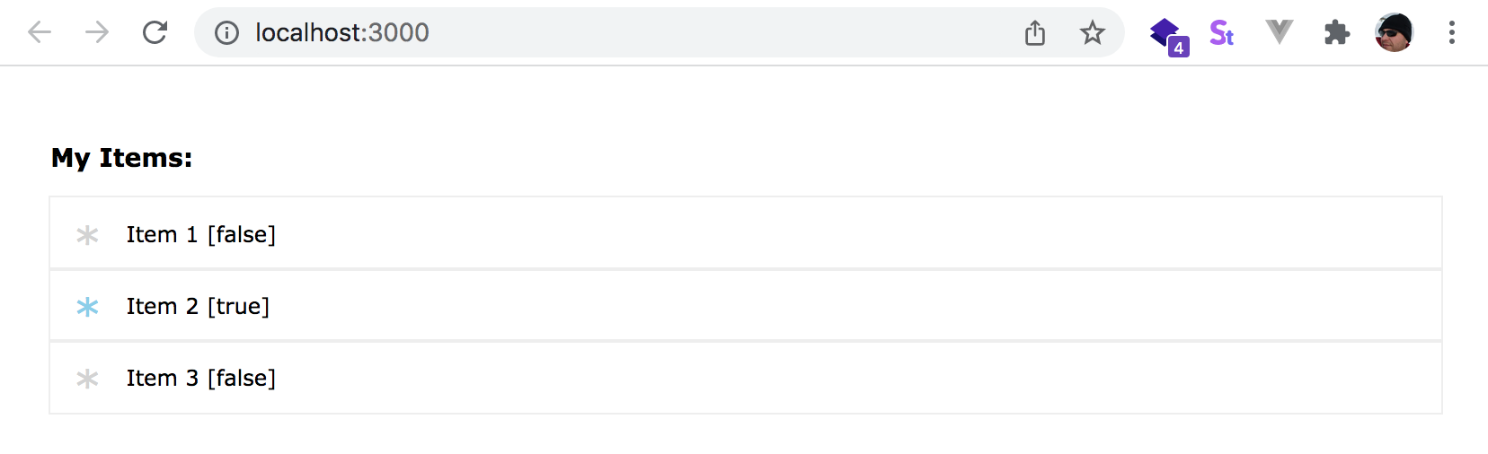
If you are not already running the app, run it. In the web browser, the list should now render similar to this (here we are showing it after we clicked on the 2nd item element and is now selected)
Chapter 5 Recap
What We Learned
- How to write unit tests against a component
- How to test that components render specific DOM elements, or have specific text, or attributes like CSS classes, etc.
- How to test events on our components by programmatically triggering them with fireEvent (from Svelte Testing Library)
- How to re-factor parts of a component to create a child component and use unit tests to validate our changes
Observations
- We did not test our ItemsList.component.svelte or more advanced behaviors
Based on these observations, there are a few improvements that you could make:
Improvements
- Add additional unit tests for ItemsList.component.svelte as well